Making Things
Strategy / Interaction Design / Front-End Development
Making Things
Strategy / Interaction Design / Front-End Development
For the last 5 years, I’ve been working as a Lead Designer at Deeplink, focusing on its suite of digital products. My job is to discover the hurdles, wants and needs of the user. Then I interpret the data to translate it into user stories, that can assume a wide range of visual formats to better inform decisions. Later, I convert them into digital prototypes that I keep testing and iterating to improve the current and future product experiences.
My performance increases with the diversity of tasks I own. From user research to interaction design, strategy or coding, having an hybrid role keeps me on my toes.
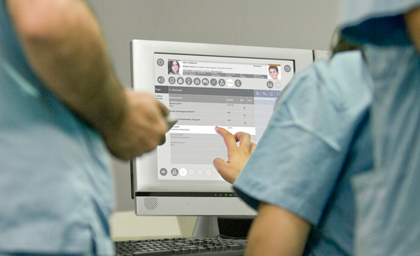
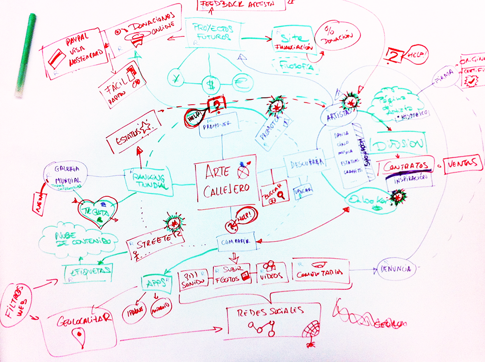
Other works I’ve done involved developing the user interface for clinic software systems, building an online network for street artists, and co-creating the experience and UI for an interactive questionnaire about breast cancer for IPATIMUP - The Institute of Molecular Pathology and Immunology of the University of Porto. Check them below:
Making Things at Deeplink
The last 5 years were all about conceptualising, building, and iterating old and new products alike. The following is an attempt to present the latest, and very intertwined, projects at Deeplink as a single case study.
Overview - What is the Deeplink proposition?
Deeplink is a full deep linking platform, offering the easiest way to drive users to a specific page inside of a native iOS or Android mobile app (as opposed to a mobile website), via organic links and from Spotlight Search. Deeplink’s mission is to be the next generation mobile search, using deep linking and preemptive AI-Assistance to make the mobile user experience better and increase user engagement.
Deeplink built both sides of a mobile search engine. First the results and demand side of the network with Deeplink organic deep linking platform (Product 1). Then, AppWords (Product 2) as the point of search, with results from the Deeplink platform.
Most of the Deeplink platform sign-ups are organic, and the serviced provided goes from the smallest of apps, all the way to the largest of brands and companies (Fox Entertainment, Verizon, DraftKings, Expedia, Transformer Earth Wars…).
Problem Statement - What is the next generation of mobile search?
On one hand, the technical language and new linking concepts may scare the less literate with tech or coding languages. Hence these products need to be easy to use not only by developers but also by marketeers, or content managers. The goal is to create a user-friendly system to support every professional dealing with digital content, in a way they can easily create links to specific pages in their apps, while measuring referrals and traffic.
On the other hand, and over time, internet search has changed. People don’t just type explicit keywords and expect results. Their actions while using mobile apps has become the primary way of declaring an intent — more than keywords people’s behaviour will point to what they are looking for. Just in the US and on iOS alone, there are almost 100B non-keyword input queries without any search results being provided.
What can we infer from a user that buys a movie ticket from the Fandango app? What is the opportunity behind their declared intent? Using preemptive AI-Assistance the action can be tied up with other relevant on-site or online experiences, such as suggesting restaurants to go close to the movie theater, or a taxi ride to the venue. These intents are massive opportunities to explore and to provide more consistent and meaningful online user experiences.
This way the driving questions are:
“How can we design a user-friendly experience for all professionals dealing with digital content despite their background?”
“How might we predict the future search engine for non-keyword input queries?”
Challenges - What to expect from a startup setup?
Due to the inevitable lower budgets and limited resources that usually a startup company has available, it was very unlikely I’d have a team of UXers to work with. It quickly became clear that I’d have a rather short feedback loop and delivery would be put to use straight away.
My job involved not only strategising, or implementing. I needed to be an all-round practitioner, from user research to design, from testing to working with developers on implementation. With such fast pace of work often times the design process had to be tweaked and not followed by the book... Anyways, done is better than perfect.
Approach
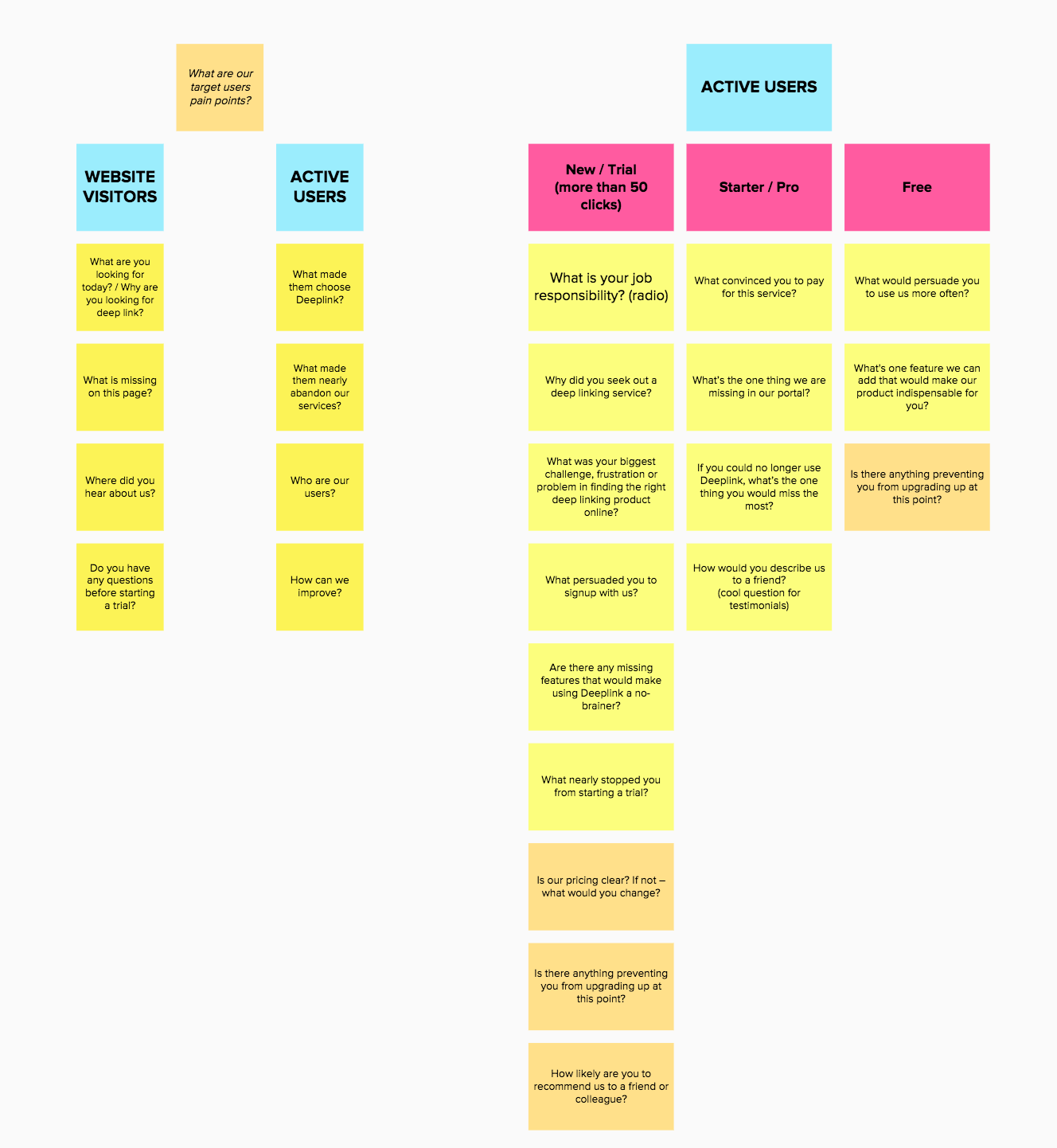
Even with limited resources, my focus was on extracting as much information as possible from the good sample of active users we have. Using a diverse set of tools, I learned to interpret and analyse their behaviour. Some of those tools were surveys, website pages heatmaps, session recordings, analytics and funnels.
Insights from the user behaviour analysis
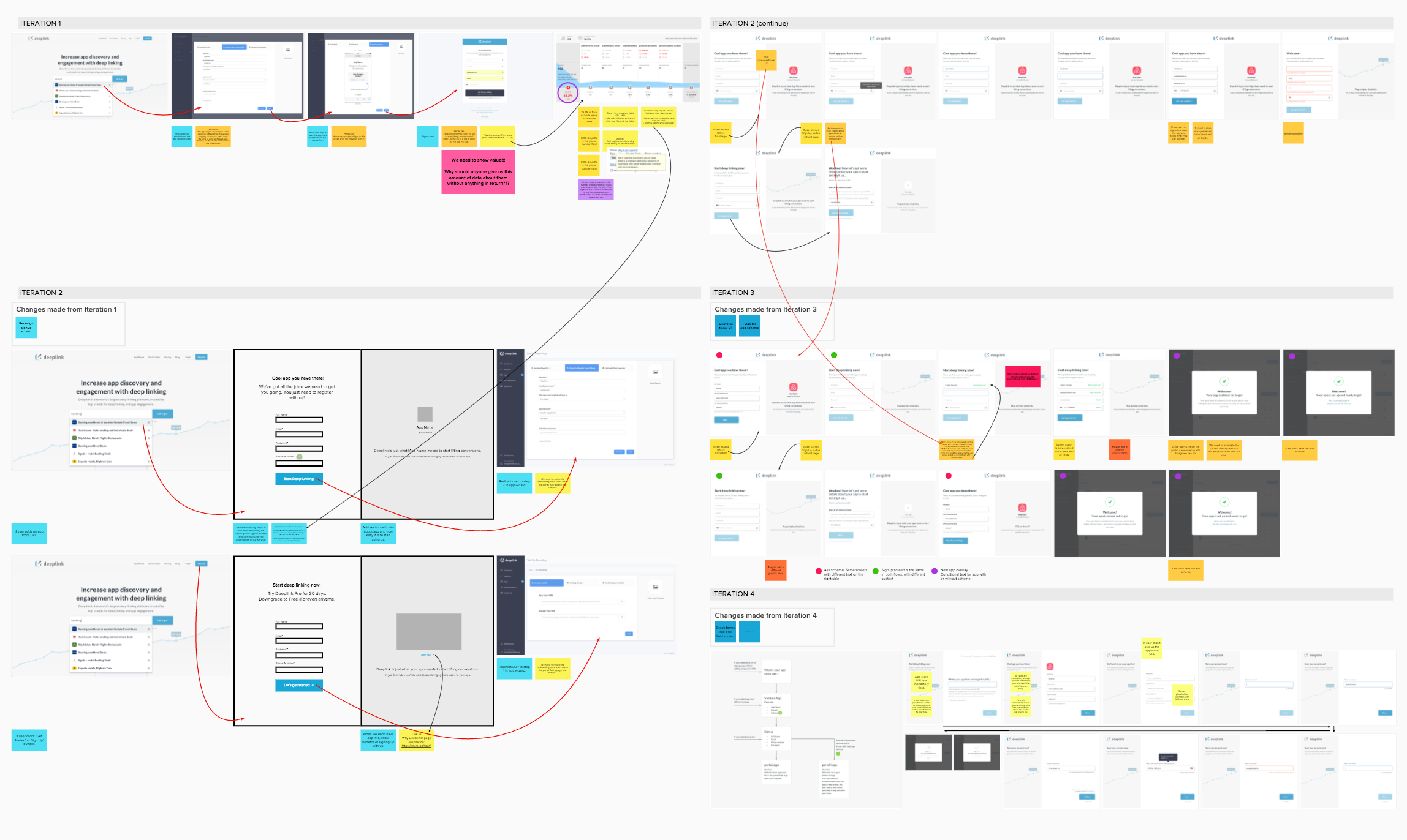
The biggest barrier to conversion on the Deeplink website was the drop-off at signup. More than 60% of visitors would not submit the signup form. It had 5 fields and the most problematic were “First Name” and “Telephone Number”. Why would the visitors give us this amount of data about them without anything in return? Furthermore, about 40% of the page visitors would use the built-in chat to ask What is deep link?
For those that actually submitted the form, the next pain point was the registration of the user app in our system. This app setup came in a form of a 3-step wizard with several fields per step. It was a complex first approach to the platform that lead to a complete drop off of a majority of the users. If the users don’t have an app setup, the Deeplink platform is useless to them.
We realised the priority would have to be the design of a What? and Why? Deeplink page in our website, and the redesign of the onboarding flow with special relevance to the forms for signing up and adding apps.
Product 1: The Organic Deep Linking Platform
We took a lot of incremental steps, and did validations as we shipped them. Seeing that an user without an app setup is someone who already is in our system but needs direction, we decided the app setup would be the first problem to tackle.
In fact, this is such a crucial step to efficiently use the Deeplink platform that it should be the first contact point even before signing up. That’s why we decided to make it a part of the signup process.
Onboarding Flow Map
Apps love to be able to simply give us their App Store or Google Play URL, and we take care of the rest. Instead of asking for a time consuming, and at times stressful, filling of a form we’ll automatically fill in what we can gather from the app stores URLs, just asking for a confirmation from the user at the end.
Seeing that the user is already retrieving something from the experience and part of what interests them is settled, the signup form comes as a logical way in to the system. This time we’ll offer insights on why that field is important and why there is value in providing that info.
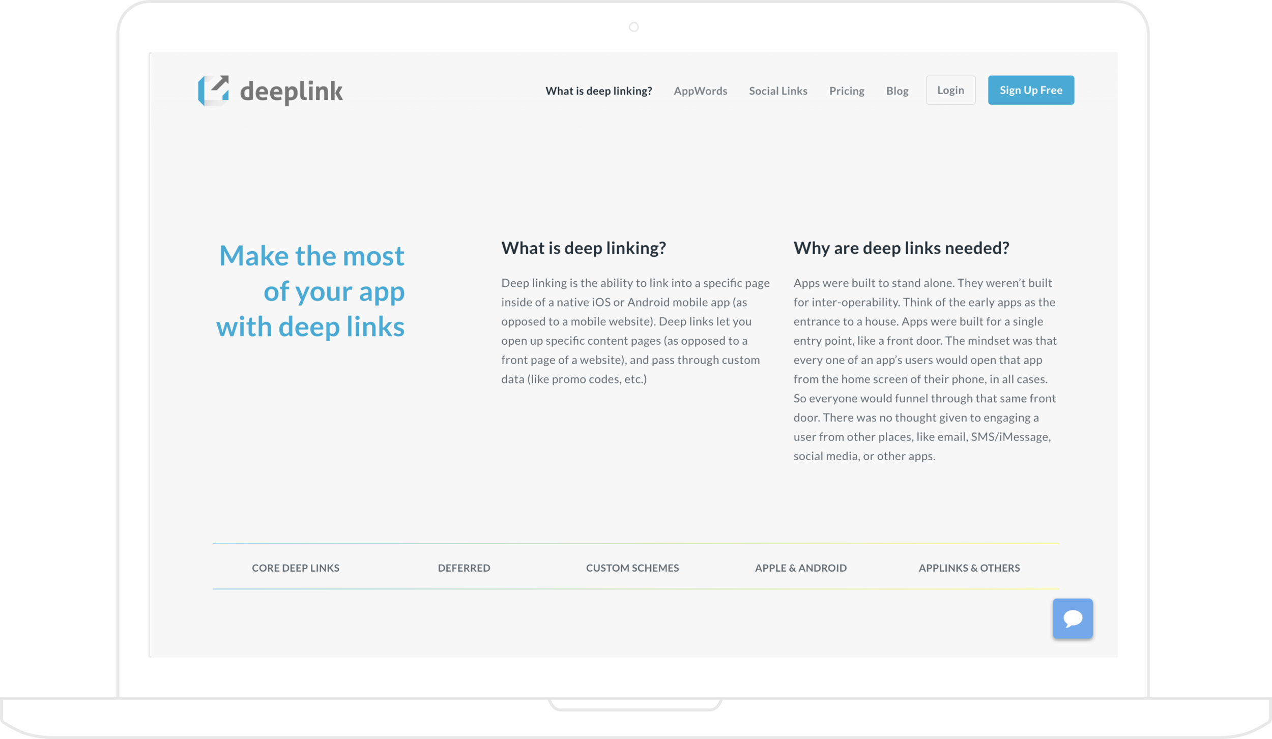
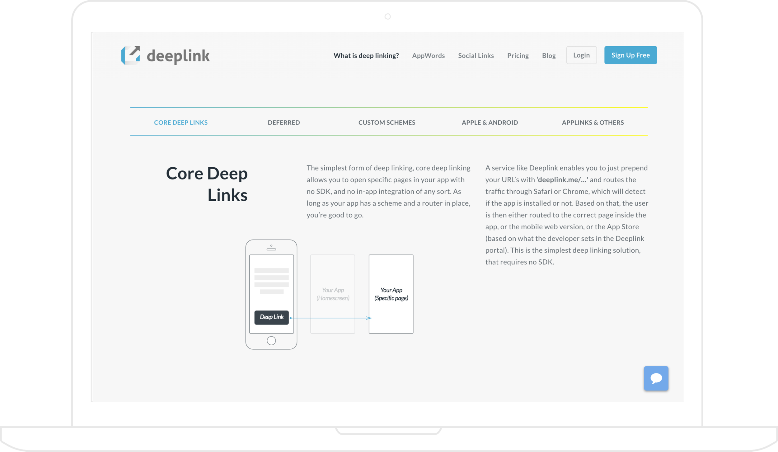
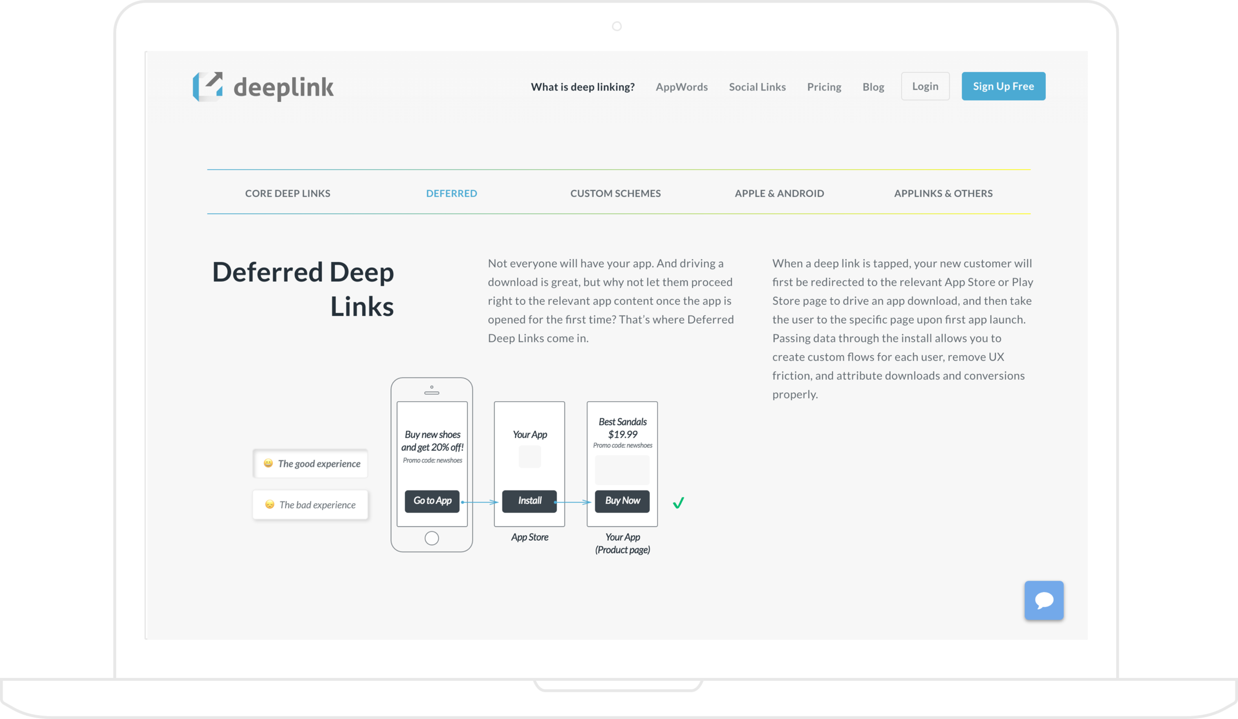
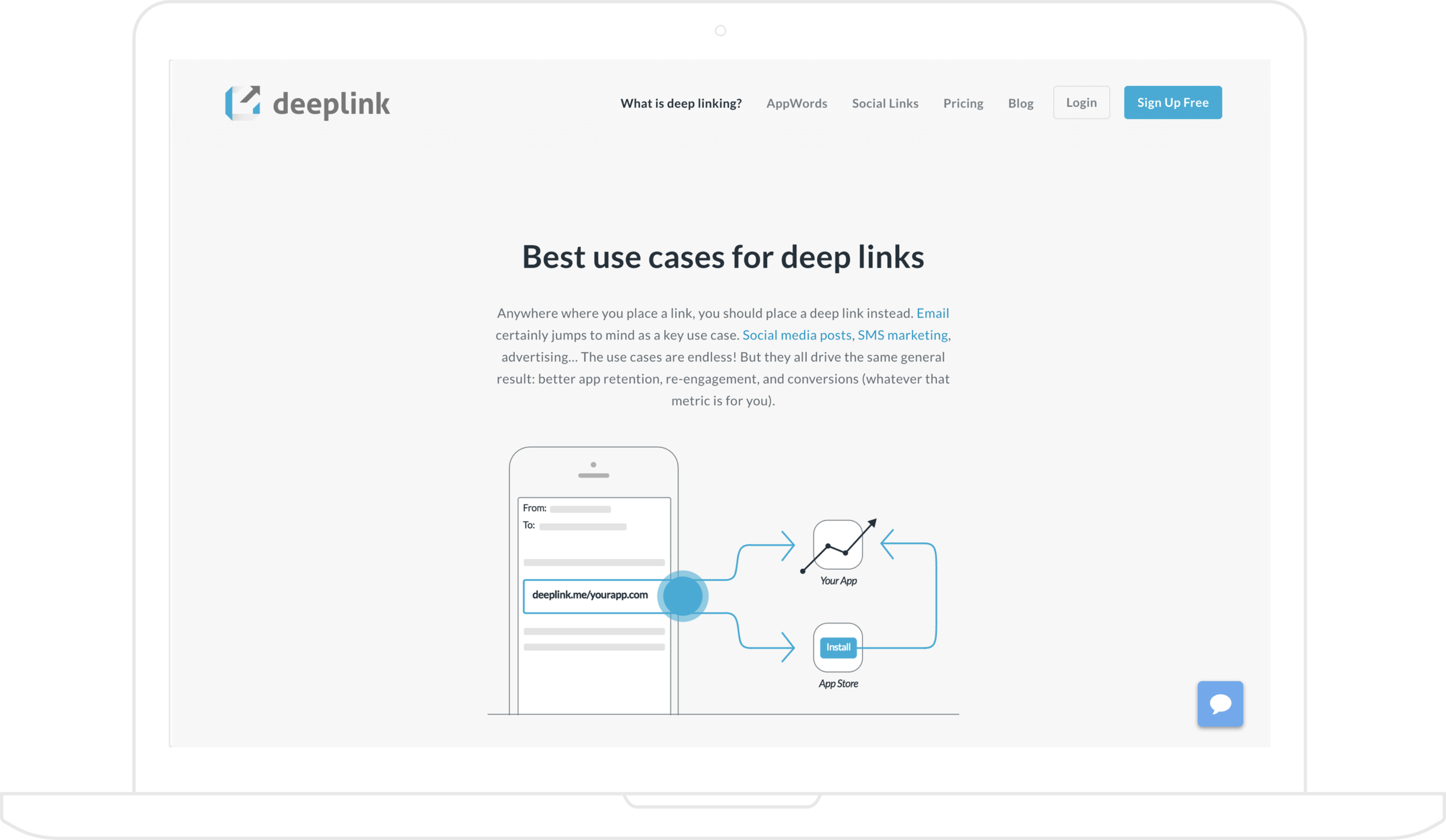
Next we redesigned our website and highlighted the What is deep linking? page by making it part of the main navigation. The curated content answers our visitors most immediate questions.
Product 2: The AppWords Assistant
The AppWords Assistant is an in-app assistant and preemptive mobile search SDK. It lives inside of the apps, anticipates what the users will want to find next, and helps them discover other great things inside that app. By using it, app developers are able to add deep linking capability to their apps and still retain its audience.
While the assistant is in the training phase- learning users habits and actions, and training the SDK AI in the Deeplink portal to provide helpful results- we built an optional cards UI to show users. The cards will feature popular deep links from the app’s Deeplink account, so when users finish an action, they can be sent to other popular and interesting pages inside of that app.
AppWords extracts the non-keyword input search from the user’s actions…
…and Deeplink’s index provides results.
As a way of showcasing the AppWords concept, we built a Concierge app that would give the user suggestions for relevant content in the apps on his mobile, appropriate to his calendar, habits and actions. Below is the prototype:
Concierge app mockups and prototype
Outcomes
The onboarding flow redesign was a success. Where before the conversion rate was 34%- only 17 in 50 people would setup an app with Deeplink- it’s now 98%. Only 40% of the apps added have clicks though, which begs the questions:
Why aren’t the deep links being used if the app is already setup?
Are these users looking for something else other than deep linking support?
Or is there yet another pain point that stops them from using the deep links?
The analysis to the website is still on hold. We can tell there are less inquiries about what is deep link and why use the Deeplink platform, but there isn’t enough data to ascertain if the changes were positive.
On a more personal note, working at Deeplink has been a great way to build up my experience in the field, make mistakes and learn at light speed. Being responsible for every aspect of the UX process gave me room to experiment and learn quickly - while unquestionably adding value along the way. It's a big responsibility that at times it feels heavy. Nonetheless it's totally worth it when it works giving me a tremendous sense of achievement.

